Iain McConchie Selected work
Below is a limited set of work samples.
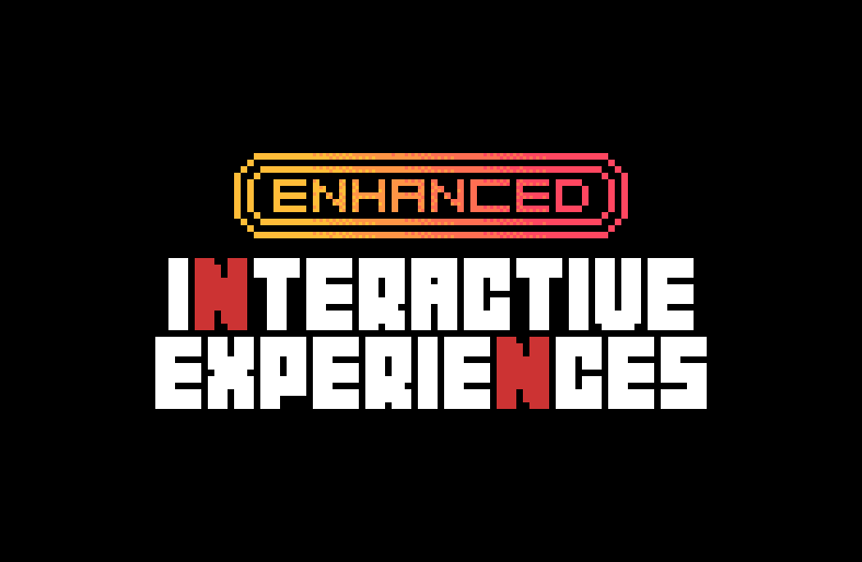
Netflix 2021—2022
Netflix - Enhanced Interactive Experiences. Please contact me for more information
- Design Management
- Team Strategy
- Design Operations
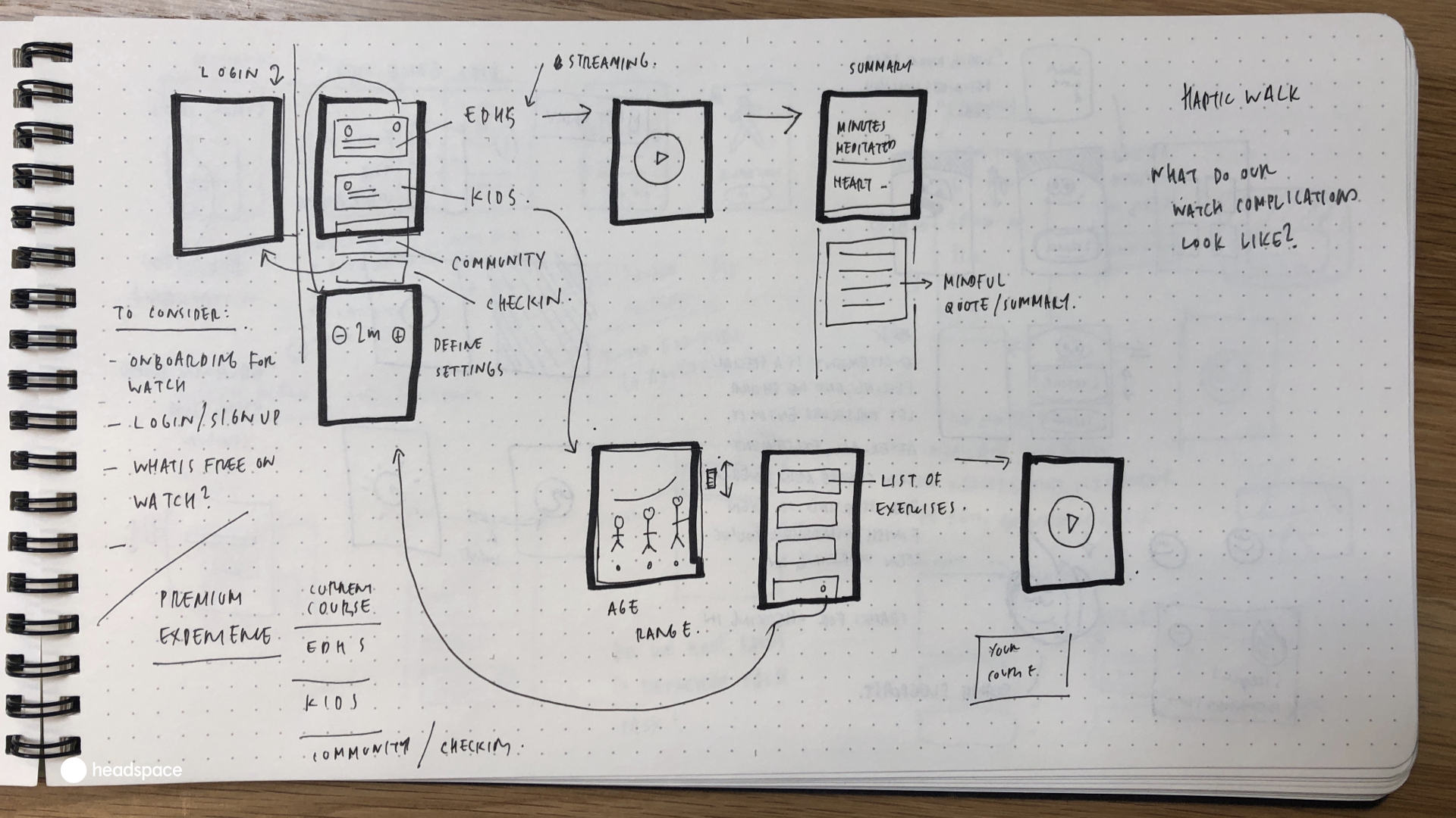
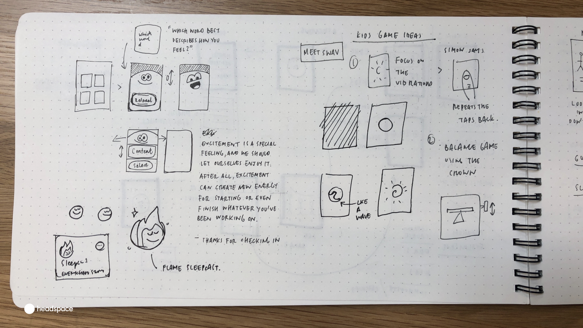
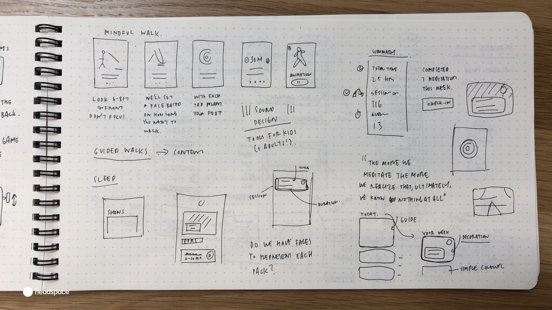
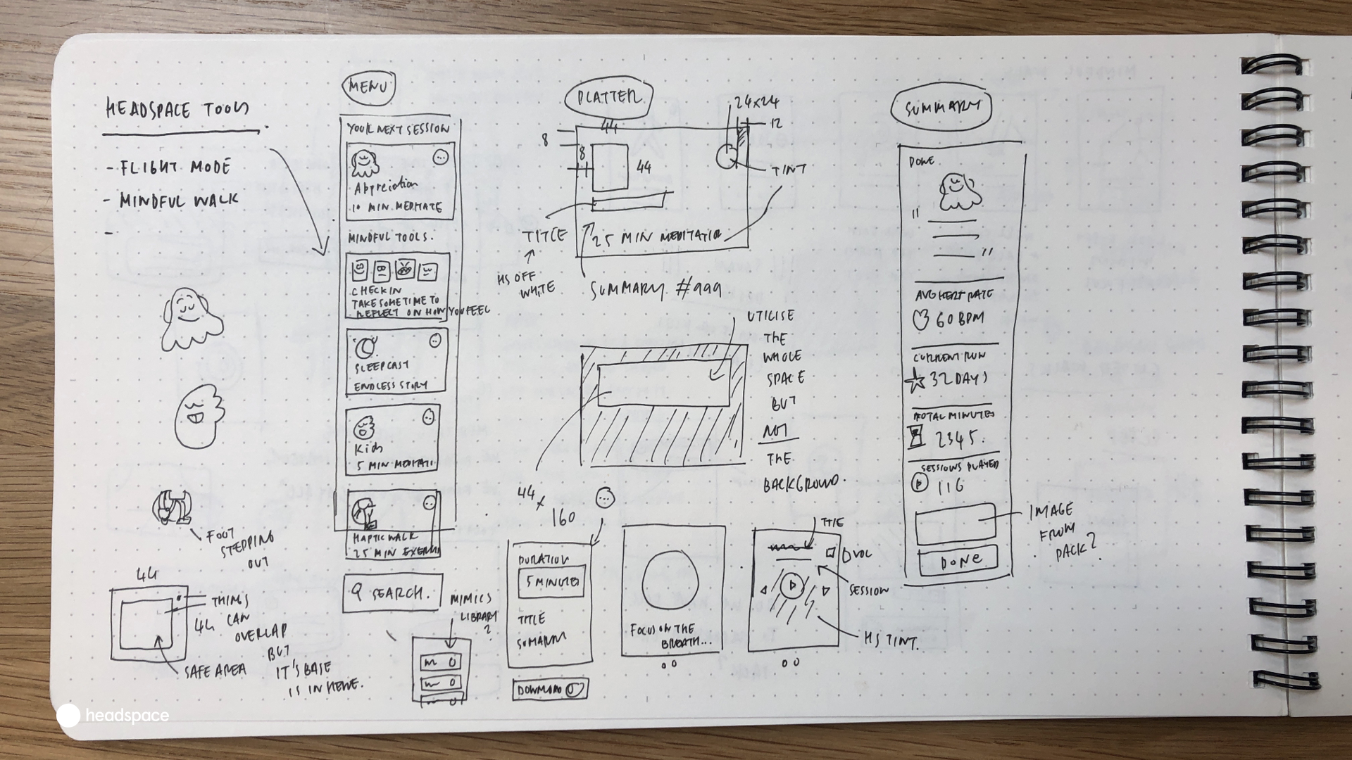
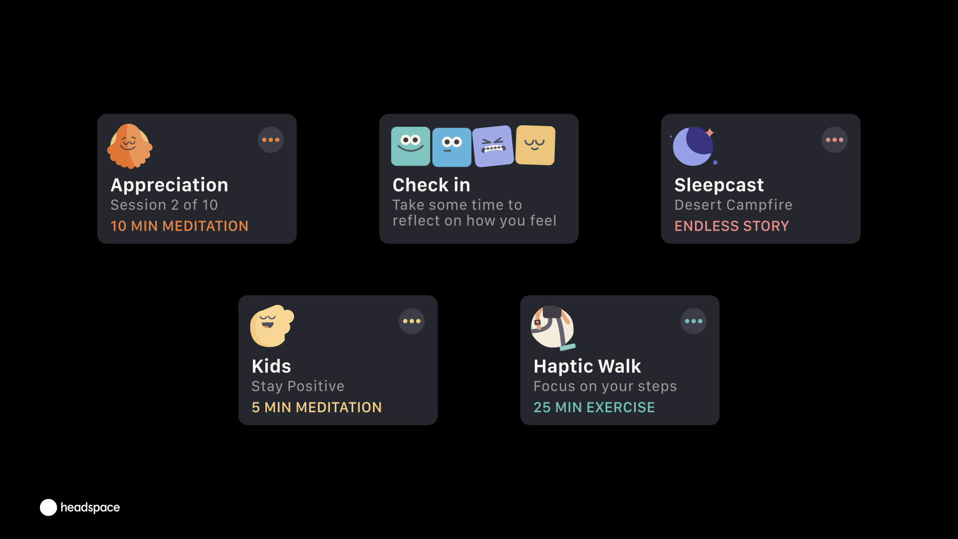
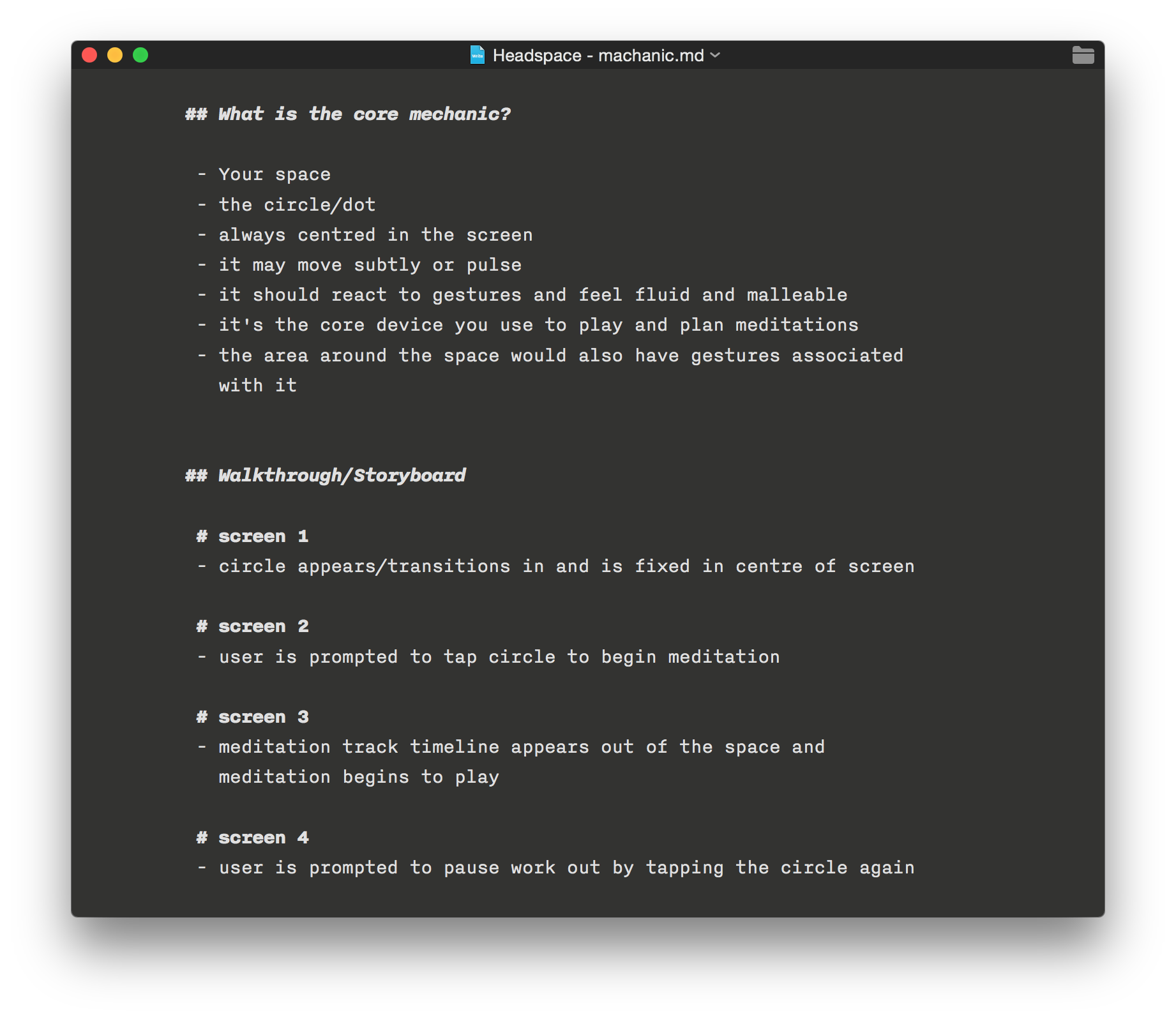
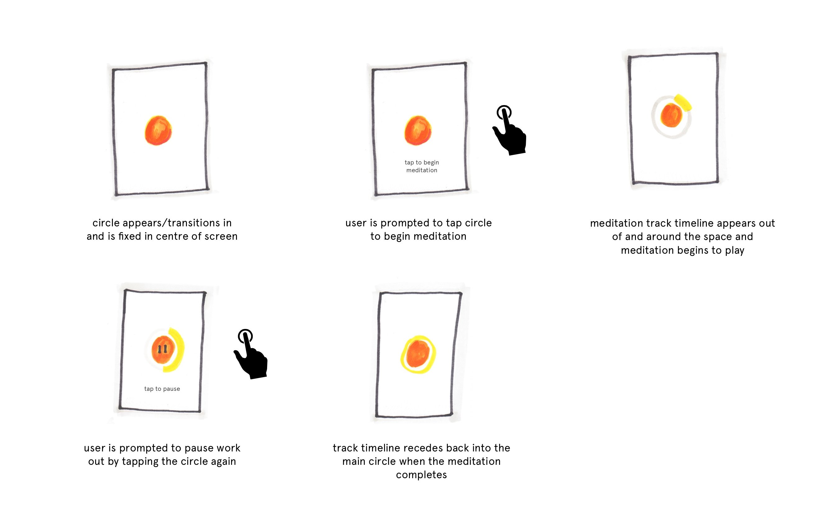
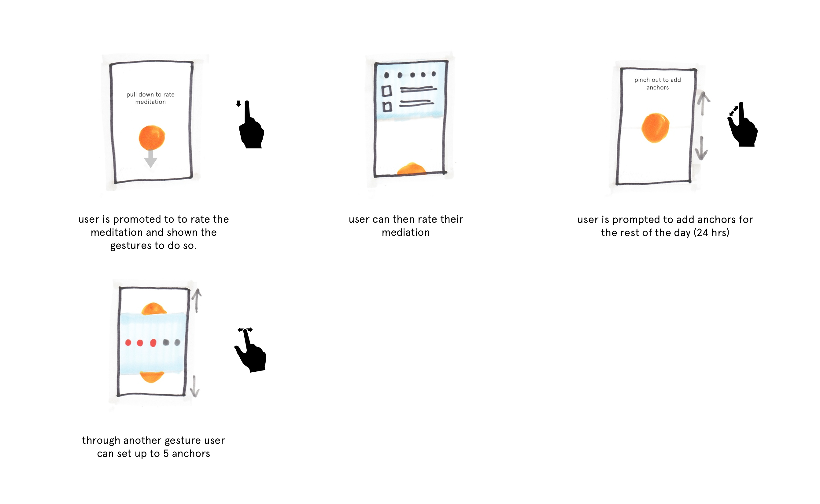
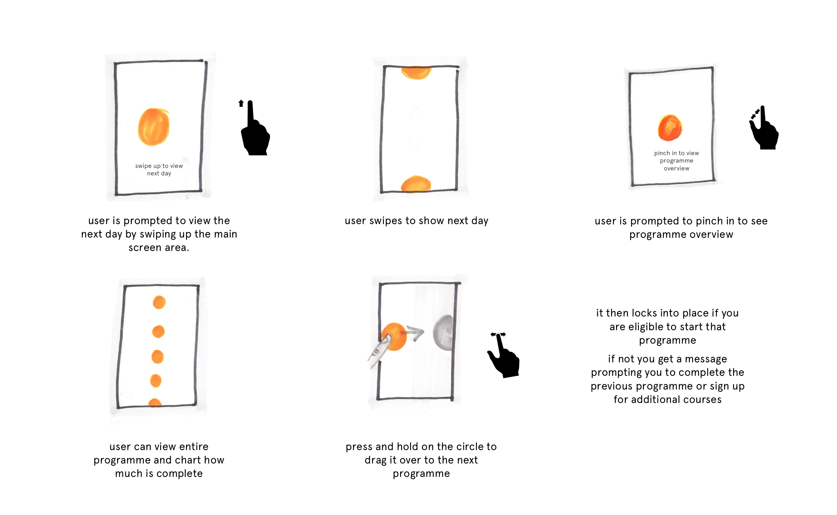
Headspace 2019—2021
Headspace - Moving beyond meditation. Please contact me for more information
- Design Leadership
- Design Systems
- Design Operations
Along with moving Headspace beyond meditation I worked on an internal design process toolkit. An amalgam of different HCD methodologies the video below is a walkthrough of the Eighterations process. Eight minutes of rapid ideation following a prompt or theme.
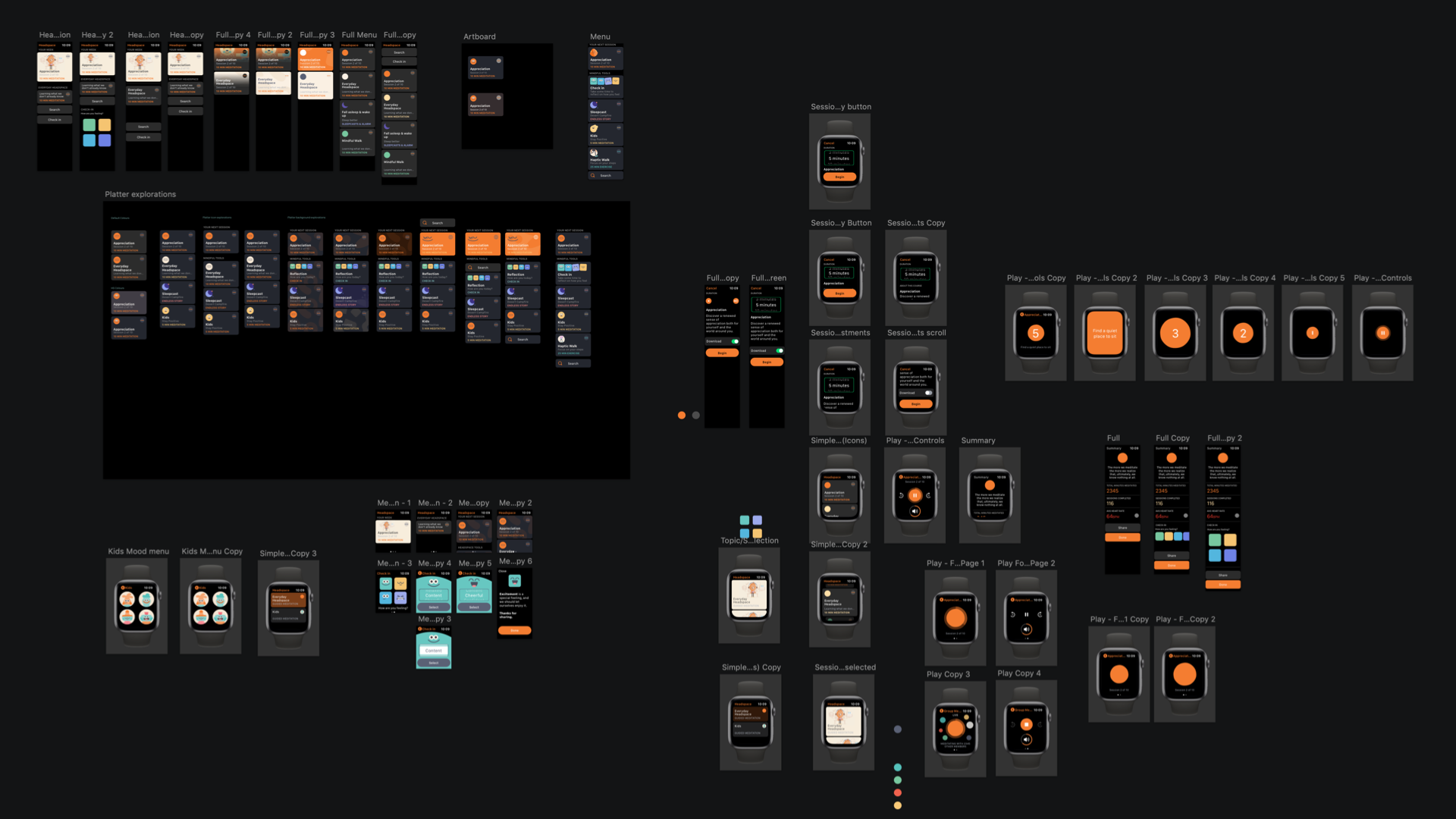
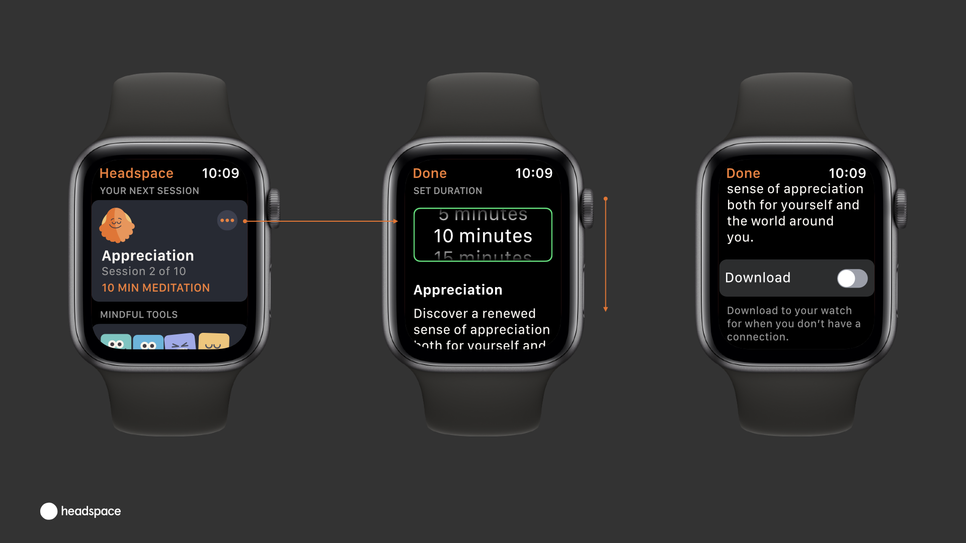
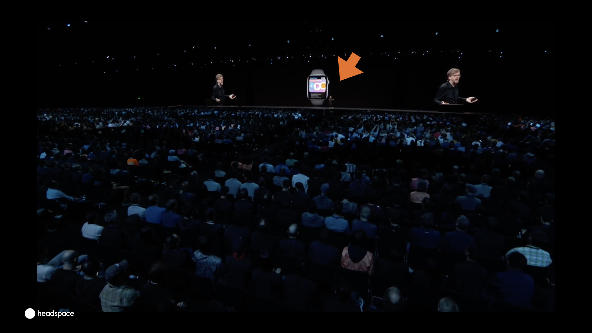
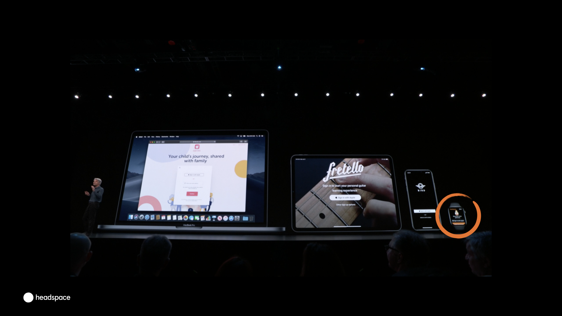
Headspace 2019 - Apple Watch WWDC 2019
- Interaction Design
- UI Design
Ahead of Apple's World Wide Developer Conference in 2019. Headspace was invited to update their WatchOS app to showcase their new login with Apple feature.
I went to some nondescript buildings next to Apple Park with one of our engineers, a sketch book and an "offline" design tool. We worked in our booth for 5 days consulting with Design Evangelists and Apple Marketing to include the new login functionality and completely refresh the Headspace Watch app experience.
Our app was selected as the WatchOS showcase app at WWDC
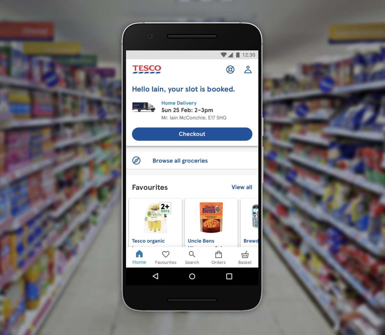
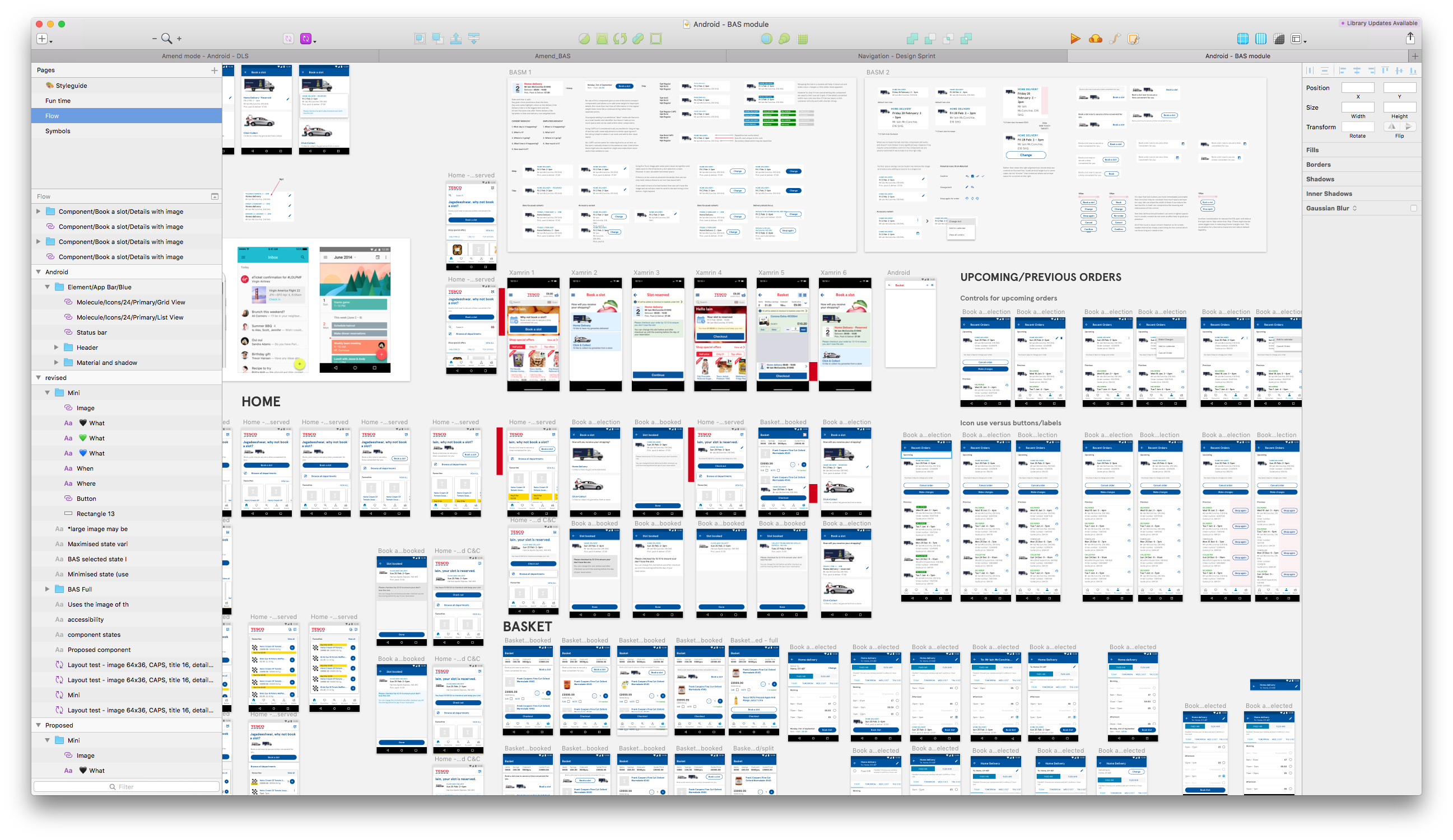
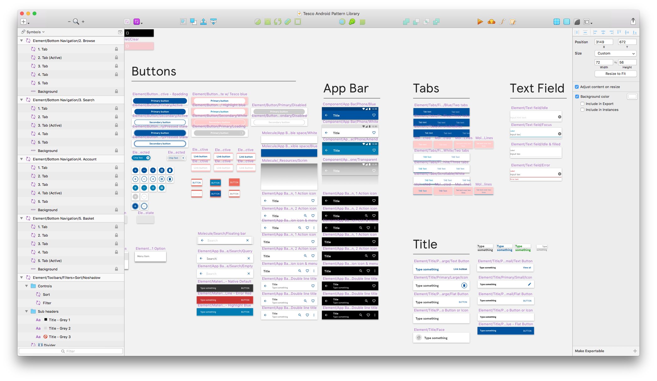
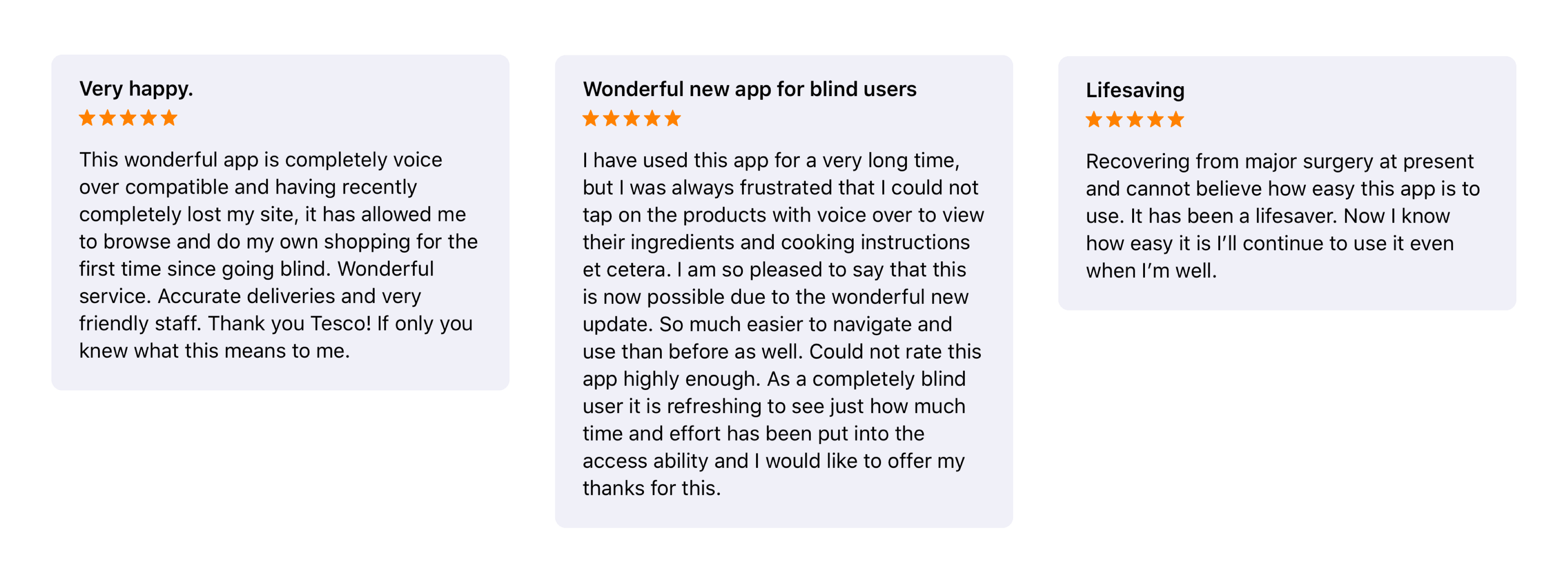
Tesco 2017—2018
In 2016 the UK grocery chain Tesco underwent a visual rebrand which included all their digital touch points. The Tesco Digital Design Language (DDL) was born and slowly began filtering across their product line. Around the same time research and conceptual prototypes began to reimagine the core groceries shopping experience on mobile. This work was conducted in-house along with an external 3rd party.
Pitched as innovation work, it was clear that while they were creatively interesting, the concepts hadn’t been considered from an engineering or product delivery point of view. My role consisted of two parts. First was to work with their internal team to take the discovery output, the new DDL and bring them all together into a usable consumer product. The second was to expedite delivery by up-skilling and embedding best practises around Design Systems, Accessibility and Product Design.
We had to distil the product experience into essential and helpful interactions, adopting an accessibility first mindset. When revenue is impacted by how successfully a consumer can find, comprehend and add an item to a basket then it's imperative that they do so with with as little friction as possible. And rather than focus on tactics to increase the potential basket value from £50 to £55, instead by making the product accessible to as many people as possible you increase the number of £50 baskets.
The net effect of the project not only increased the number of baskets but, even without that as the focus, it also increased the overall value of the baskets. Positive review submissions of the app increased by over 1,000% a month after the initial release, which had the halo effect of increasing the number of people actively using the service.
- Design Leadership
- Design Systems
- Design Operations
- Interaction Design
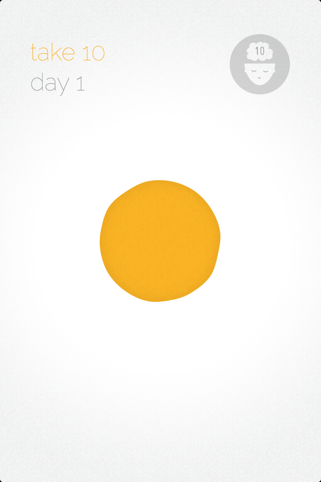
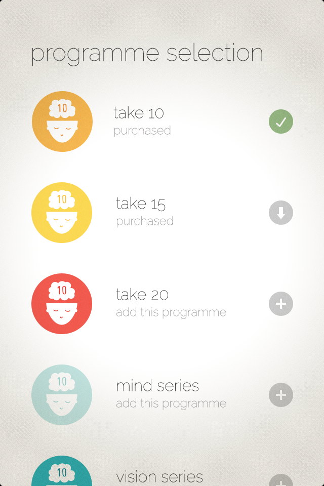
Headspace — 2012
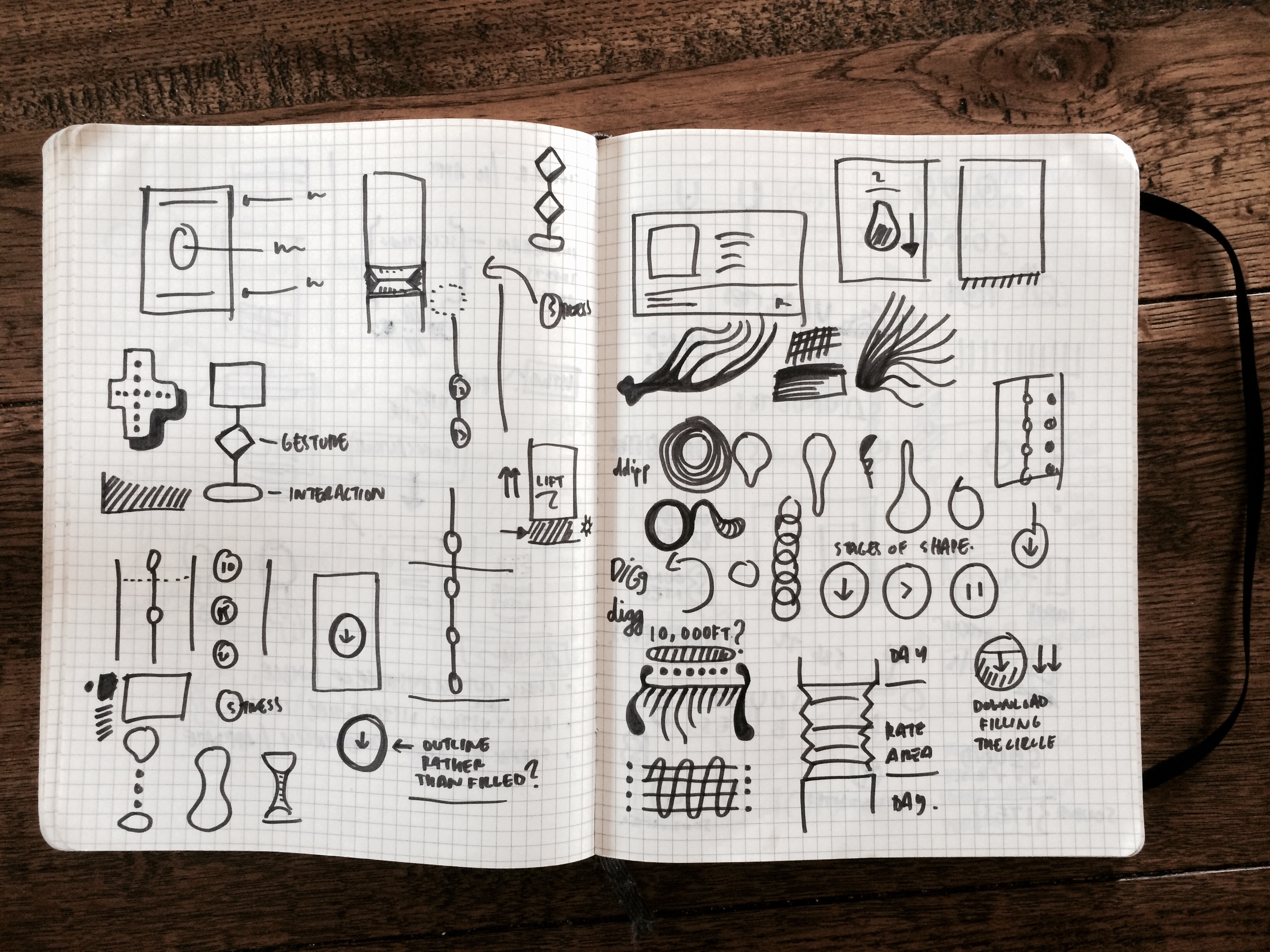
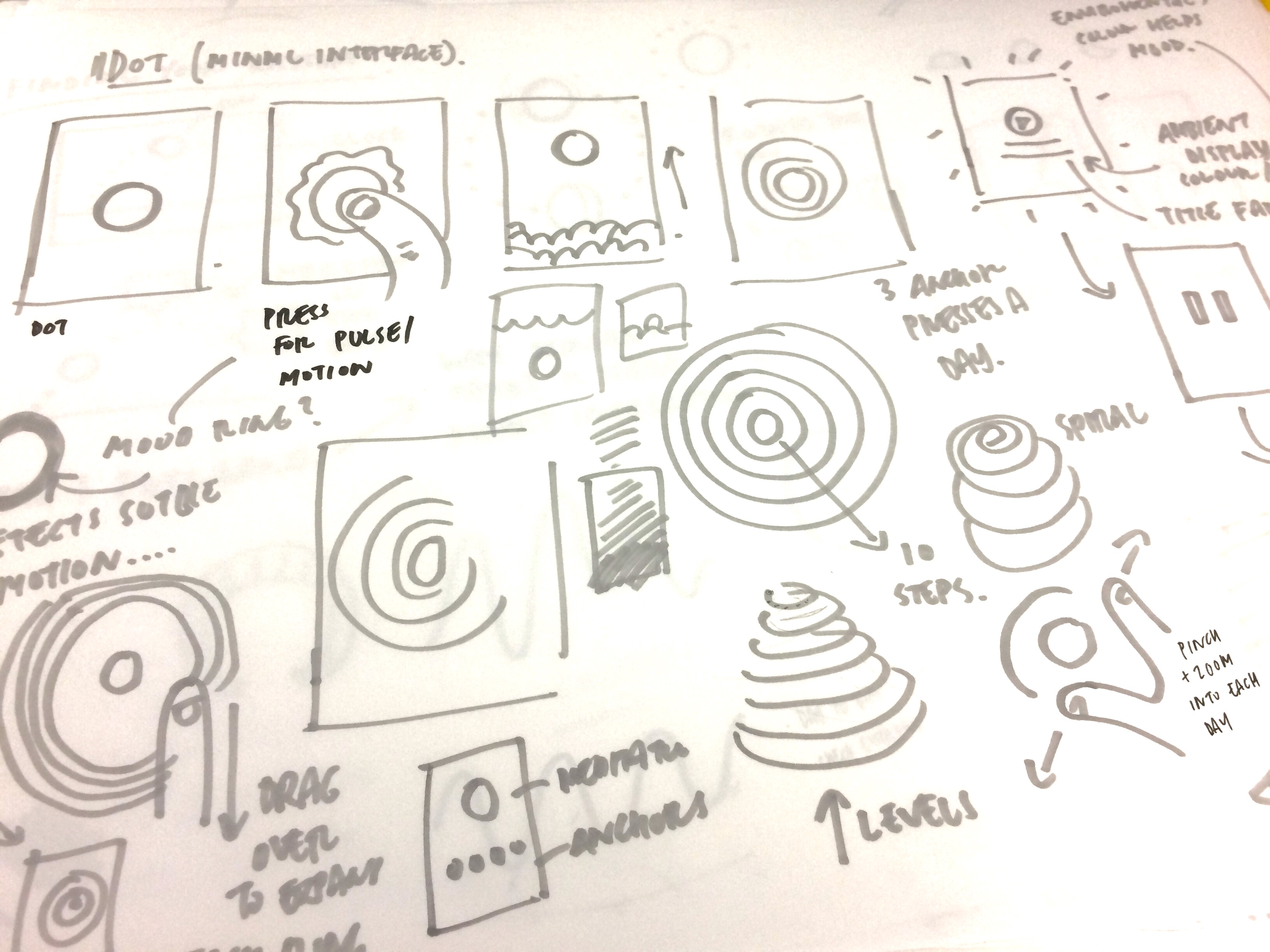
The original engagement with Headspace was to try to fix user behaviour within the constraints of their app. Taking a more holistic approach myself and the team examined not only the app but their complete service offering and looked to simplify that before generating anything else. This involved a number of key activities including a workshop with the founders Rich and Andy, mapping out their website and getting insight from the Headspace community.
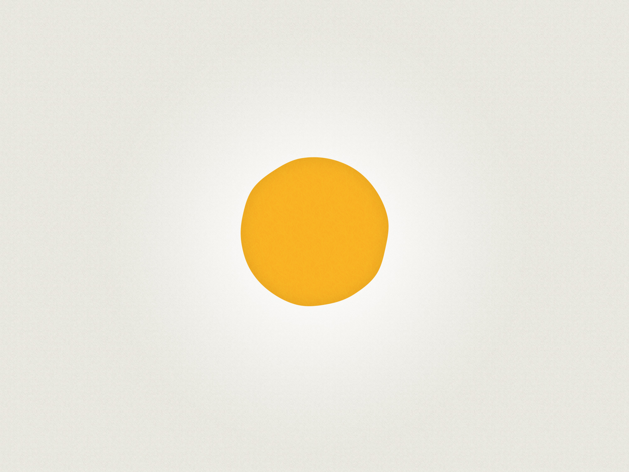
In doing so we reduced the concept and key interaction of the app to a singular dot, pulsing and imperfect, a malleable representation of your headspace. Information was presented only when necessary and faded away once you pressed play. This reduction of visual noise and clutter was applied throughout the app and then extended out to the Headspace brand which underwent a complete redesign as a result of the work.
The app currently available is a tweaked and refined version of the app we created for them having parted ways about 80% into the final build. However the core concept and aspects of the user experience remains.
- Workshop
- Concept
- Creative Direction
- Interaction Design

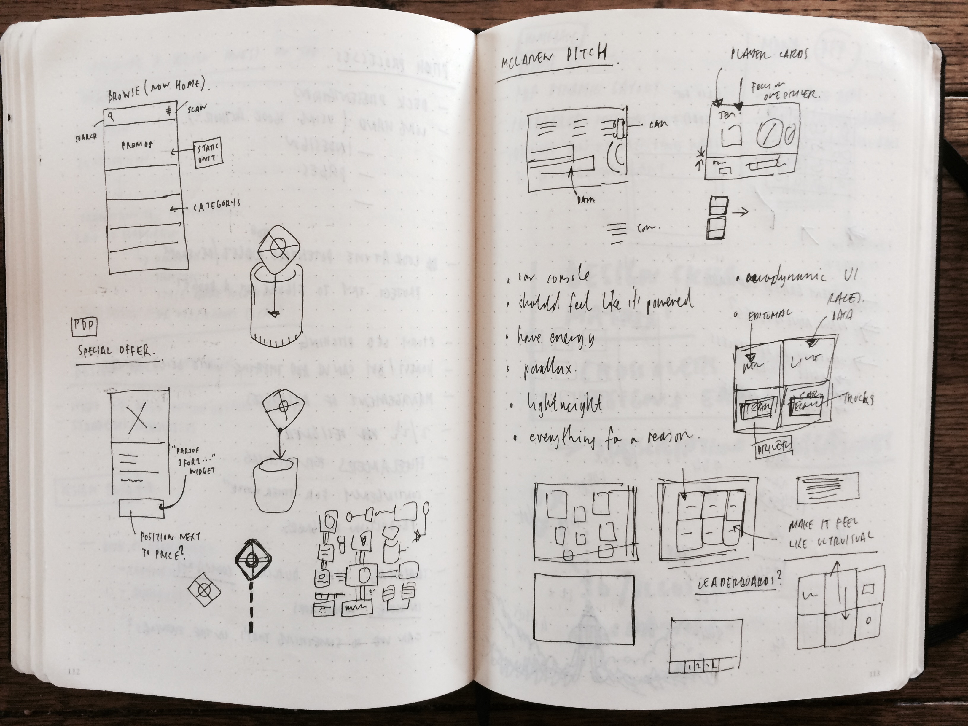
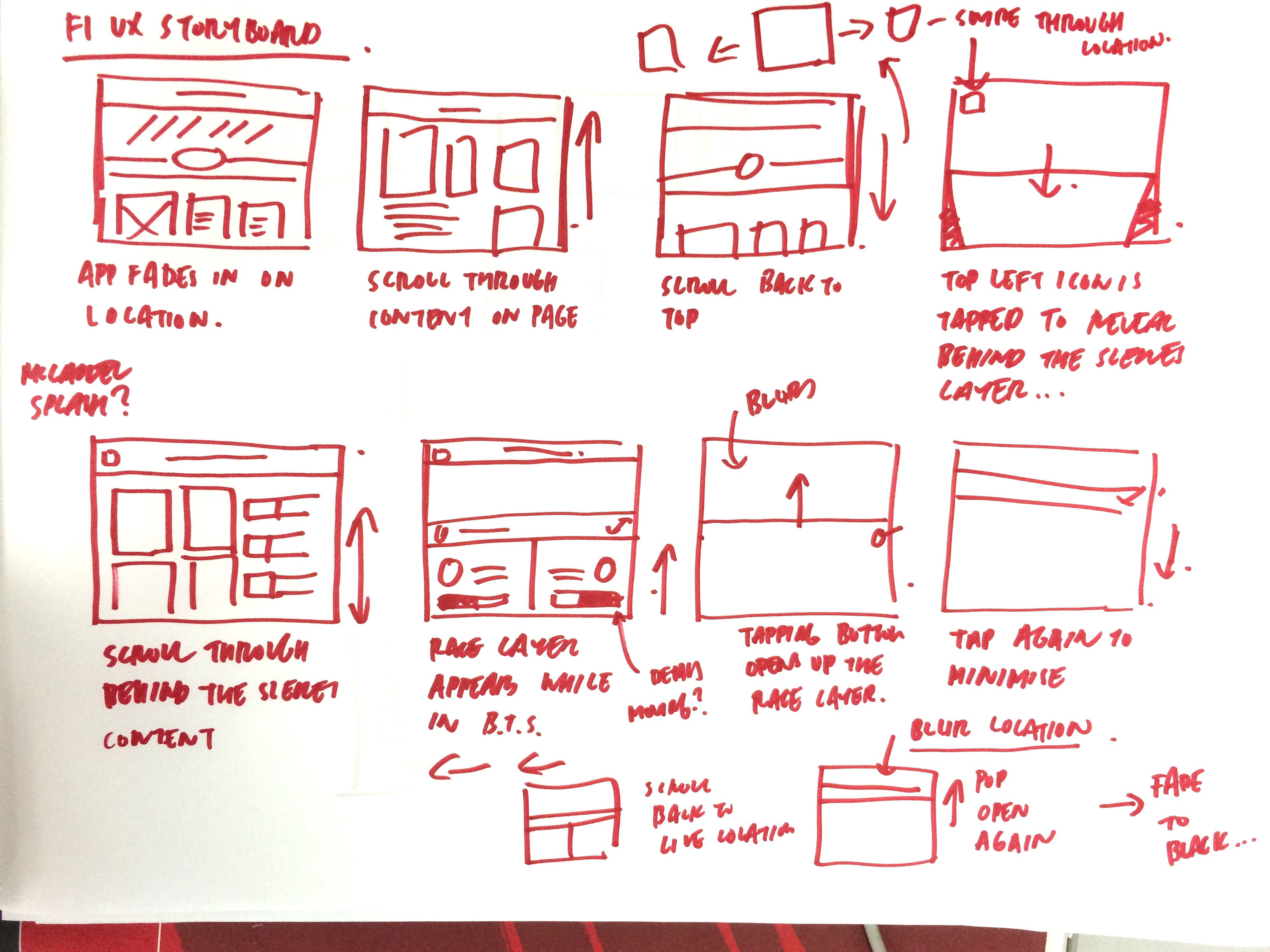
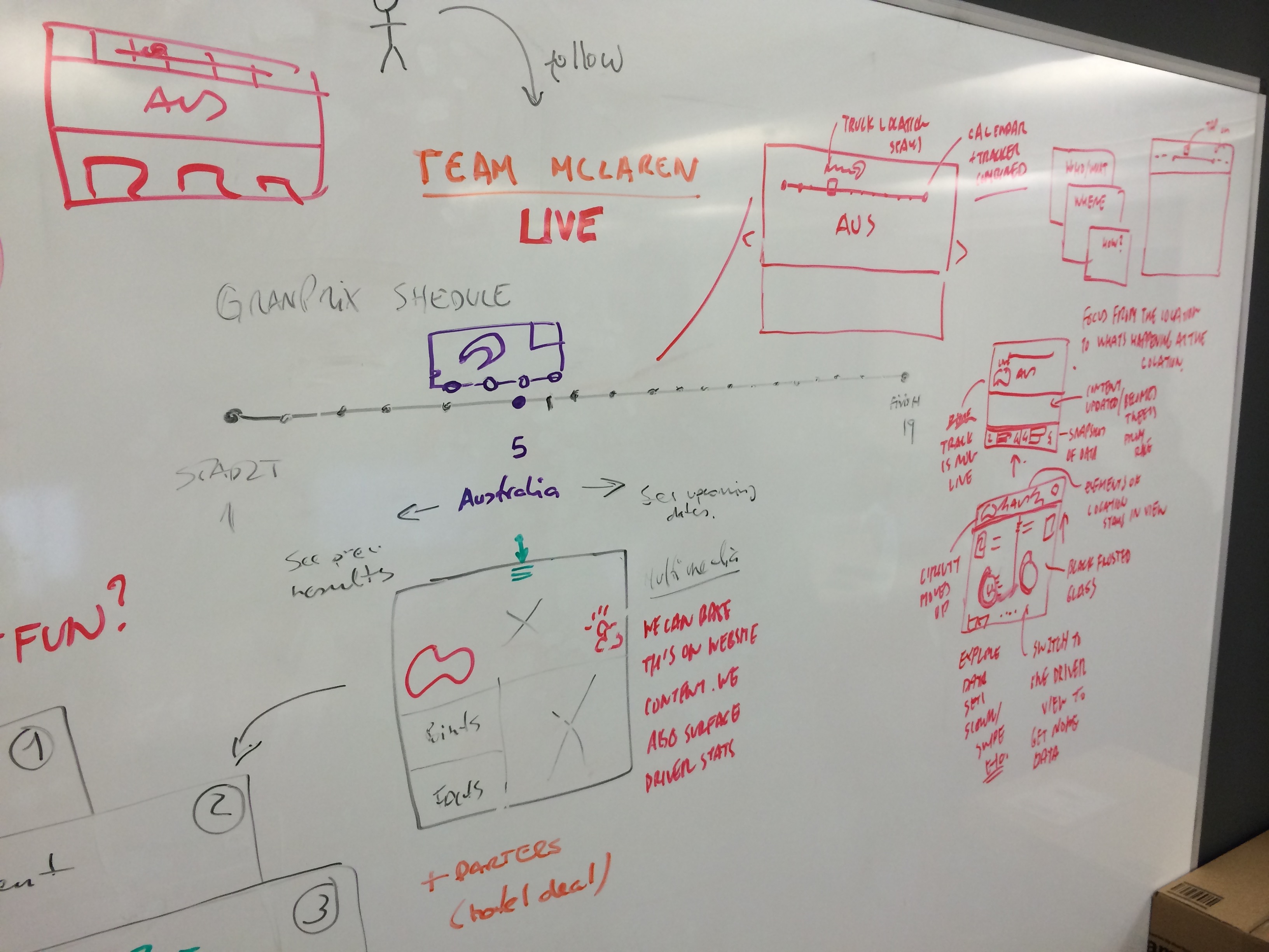
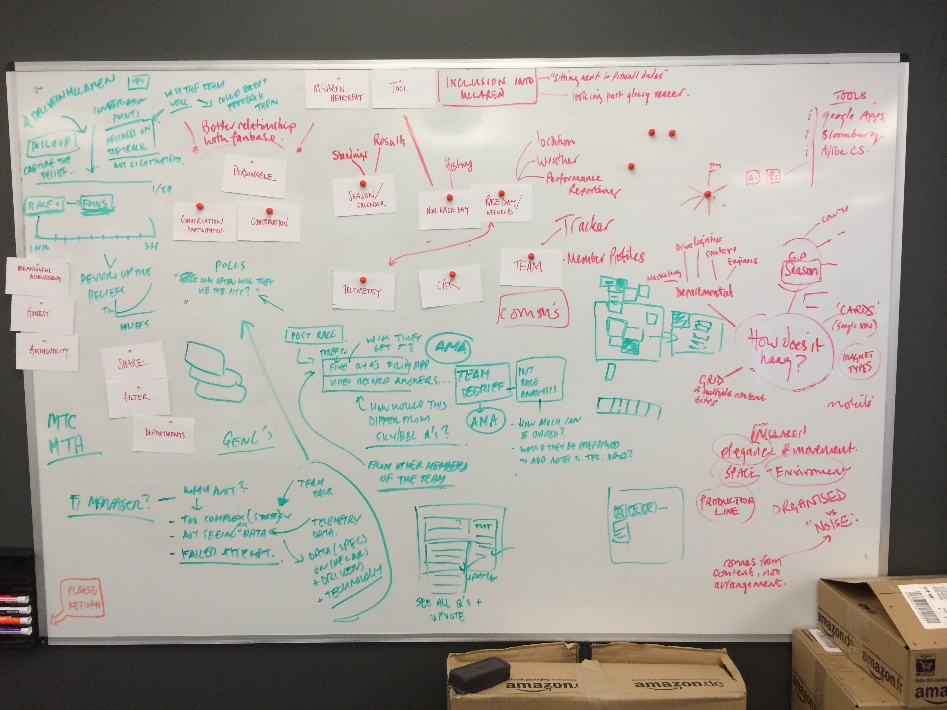
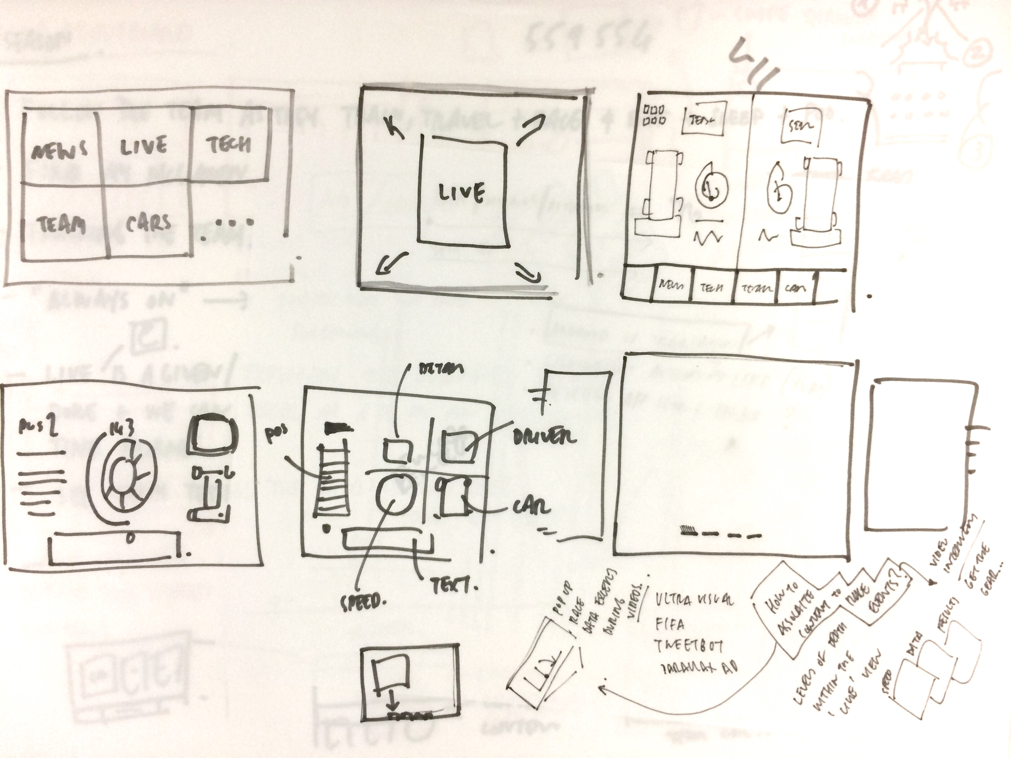
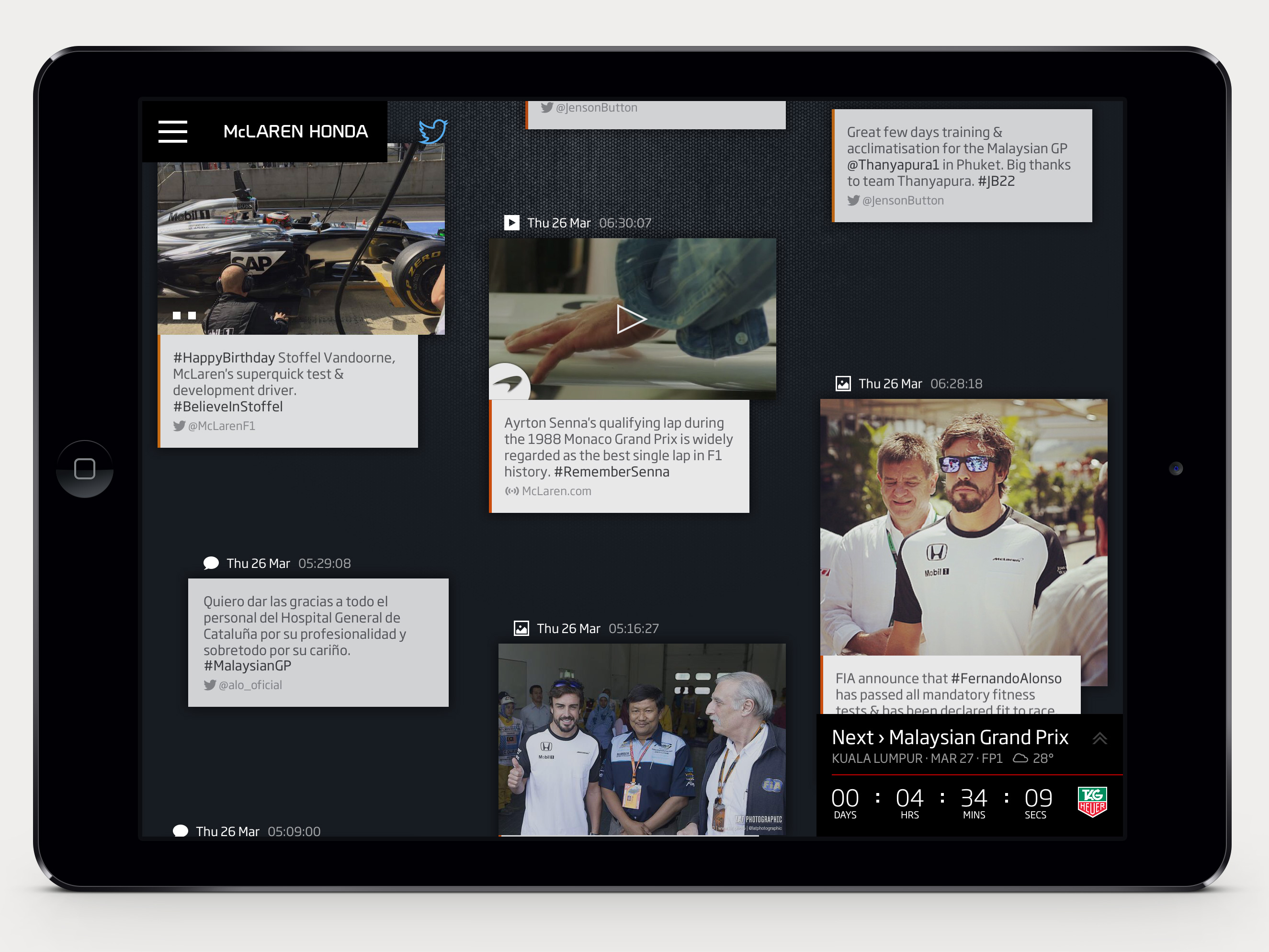
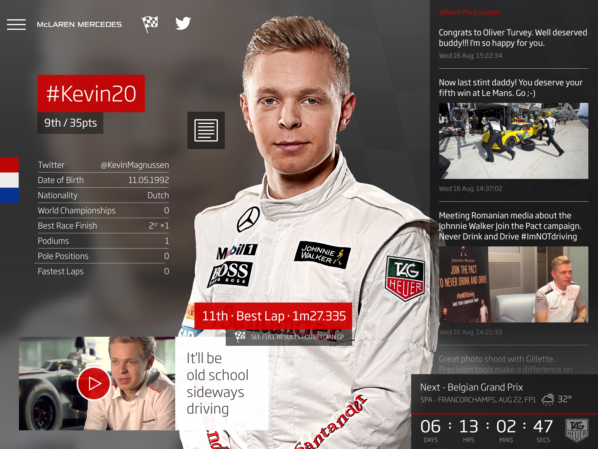
McLaren F1 app
The core concept was to create an app that would enable fans of the McLaren F1 team to get closer to the not only the drivers but the entire F1 team experiencing every aspect of what it takes to be a successful Formula One team.
Along with information on the drivers, the seasons car, tracks and team partners, the Transmission Centre collates all social media output from a variety team members (not just the drivers) and delivers them in a dynamic and fluid timeline. This content represents more than just the official McLaren voice, giving you a more rounded and raw view of the entire team.
This was then backed with a live panel which gives you a realtime pit crew communication along with statistics on the car tyres and driver position.
- Concept
- Creative Direction
- Interaction Design
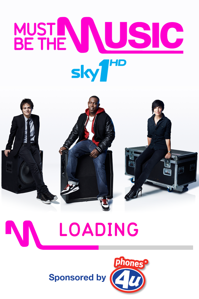
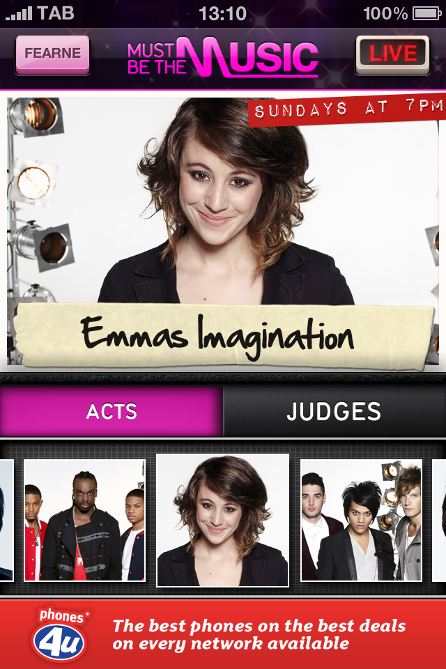
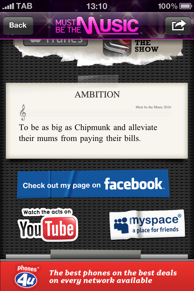
Sky1 - Must be the Music
An X-Factor/Britain's Got Talent clone for Sky1. The app supported the show and provided a live content experience along with background on the acts and judges. Back when iPhones were a fixed size and we loved depth and texture in our UI.
I designed the entire app UI, textures and details as well as the overall experience. I also designed an original app icon based on an a guitar amp and the show logos.
The app is no longer available for download so lives on with these visuals
- Concept
- Interface Design
- Icon Design
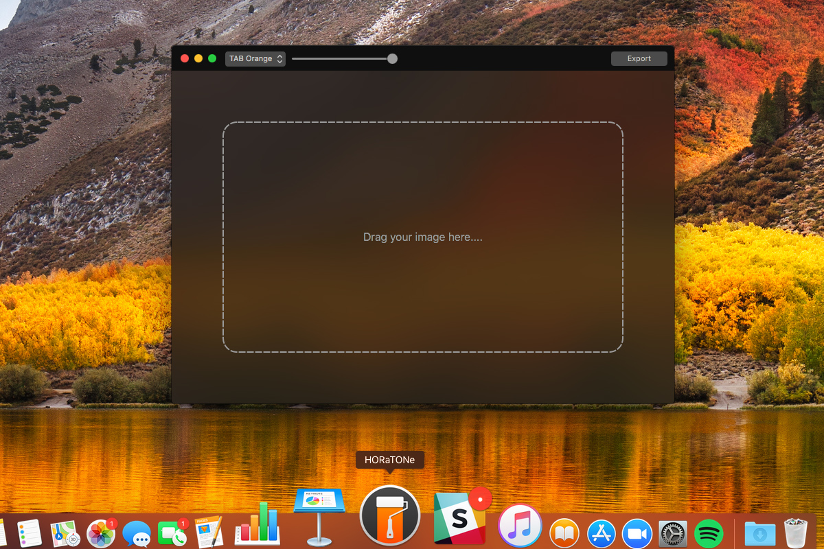
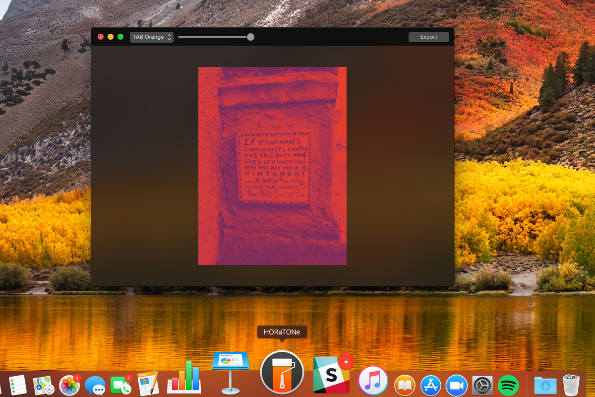
HORaTONe - MacOS app
I'd often spend hours in Photoshop converting photographic images to branded duotone images to use in company presentations. While a useful action existed it still meant someone with Photoshop having to convert the images. After discussing this with one of our engineers, Neil Horton, he reckoned he could make a simple Mac app that would allow anyone to drag and drop an image in and get a duotone out.
The app turned out to be not so simple to build in the end, but the output is a very focussed and specific app that saves countless hours and keeps things consistent with the brand.
- Concept
- Interface Design
- Icon Design
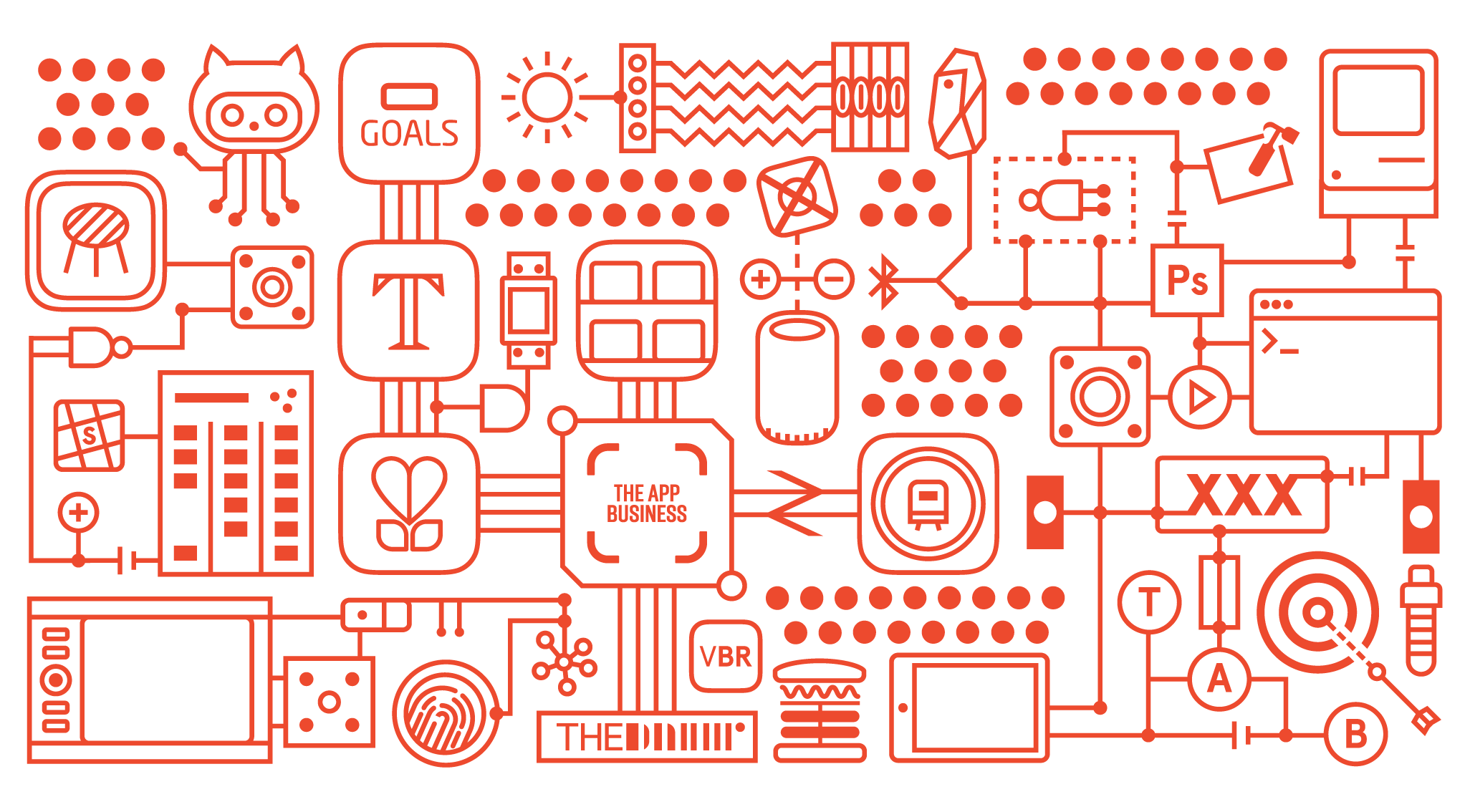
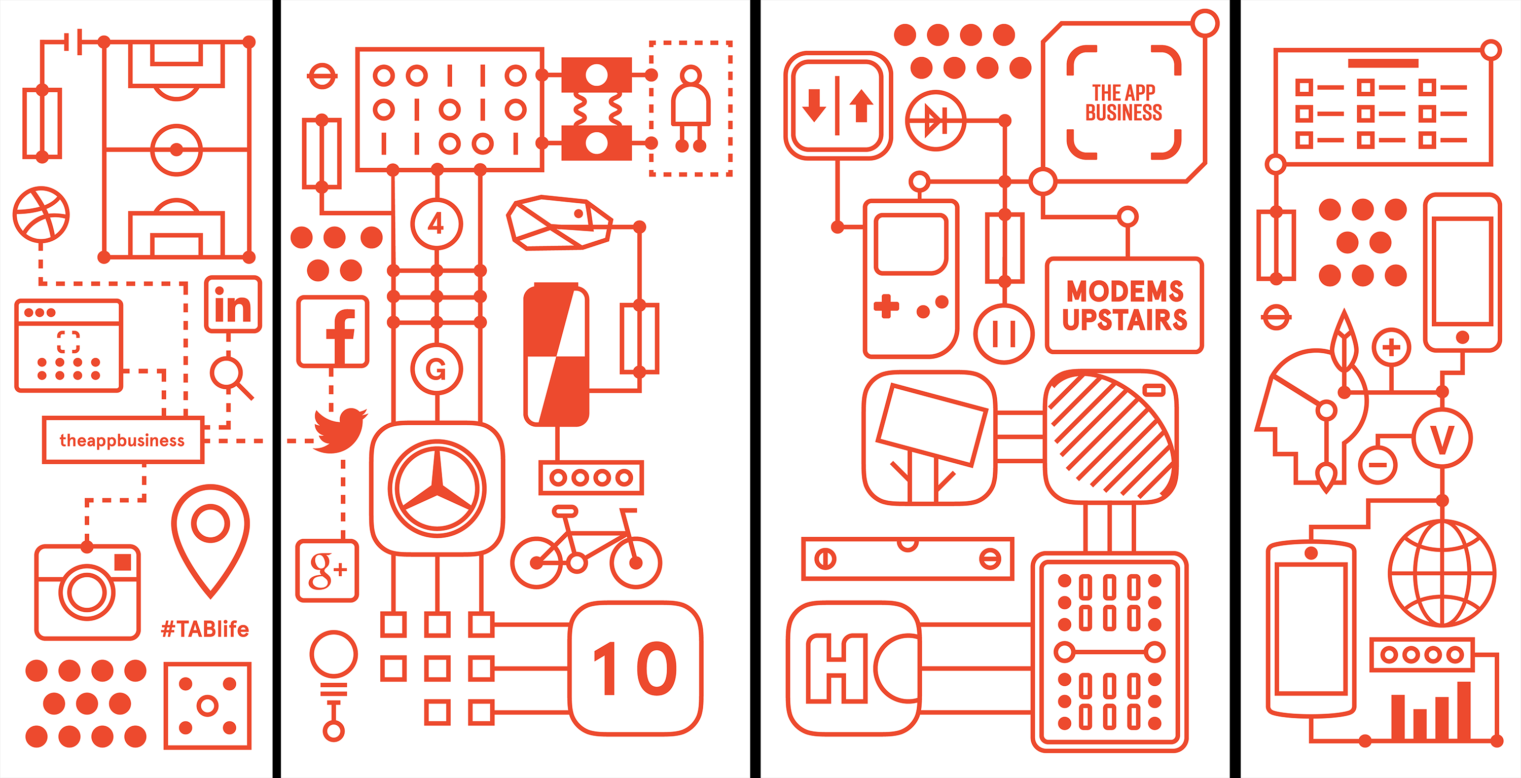
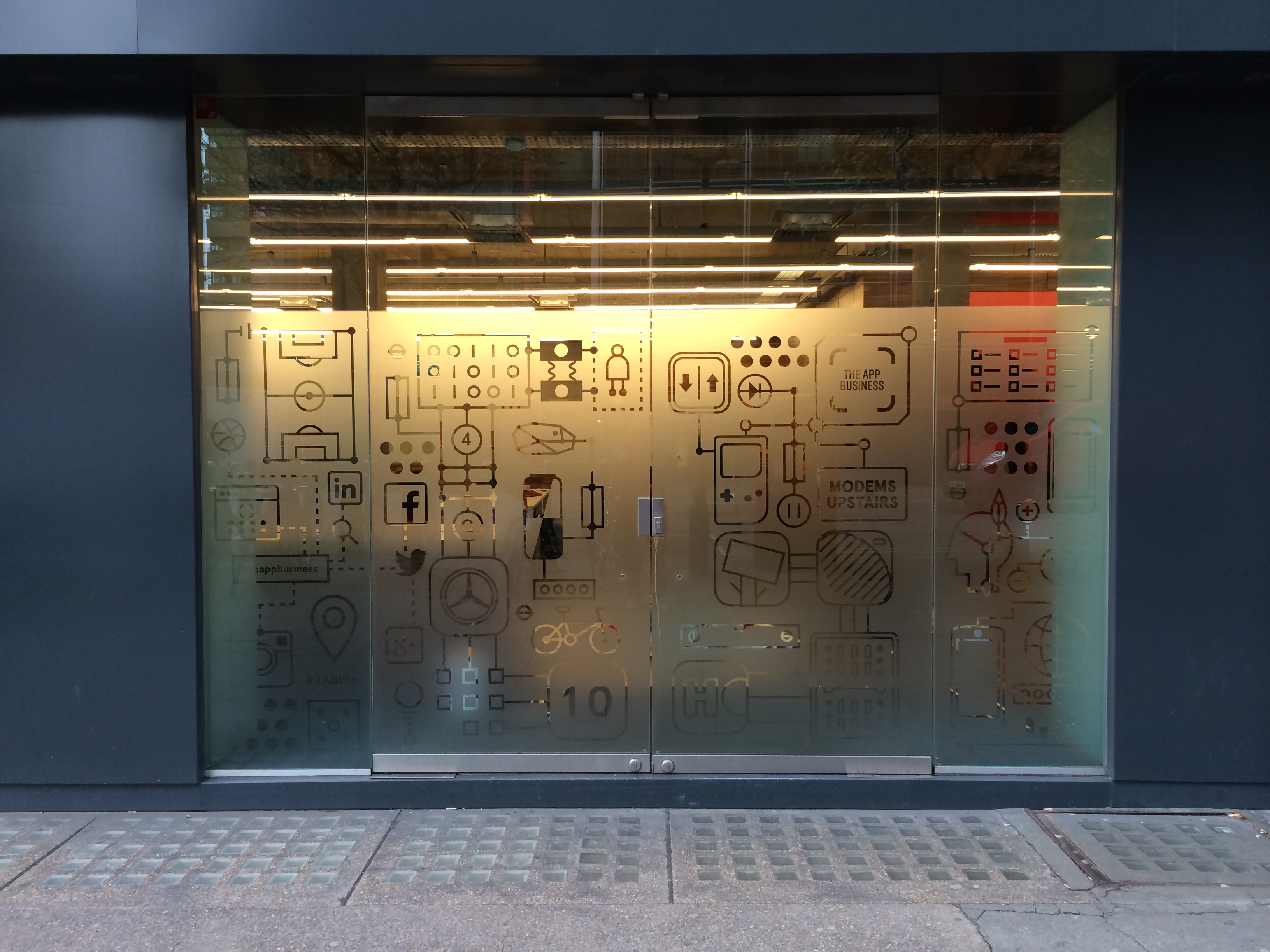
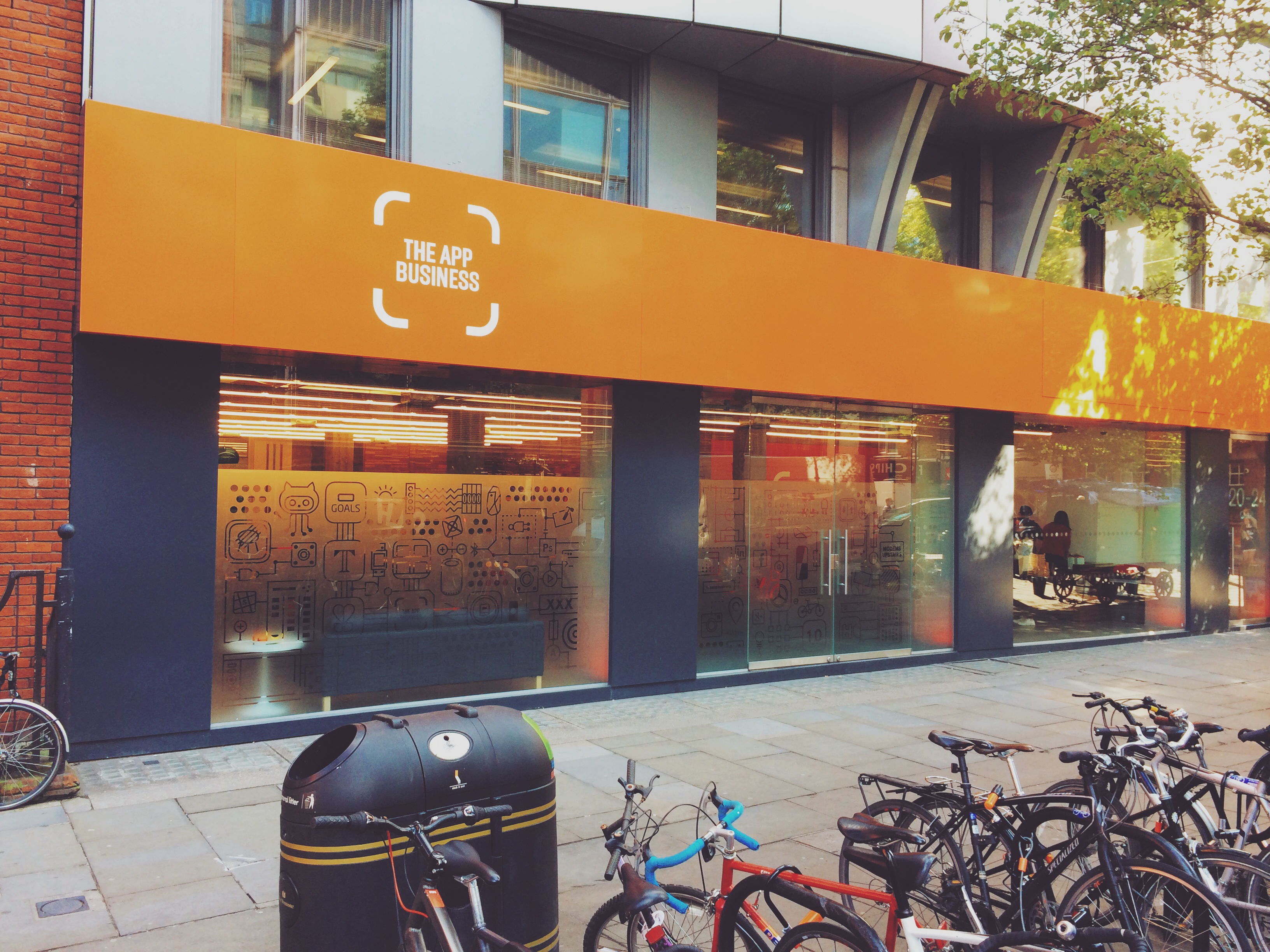
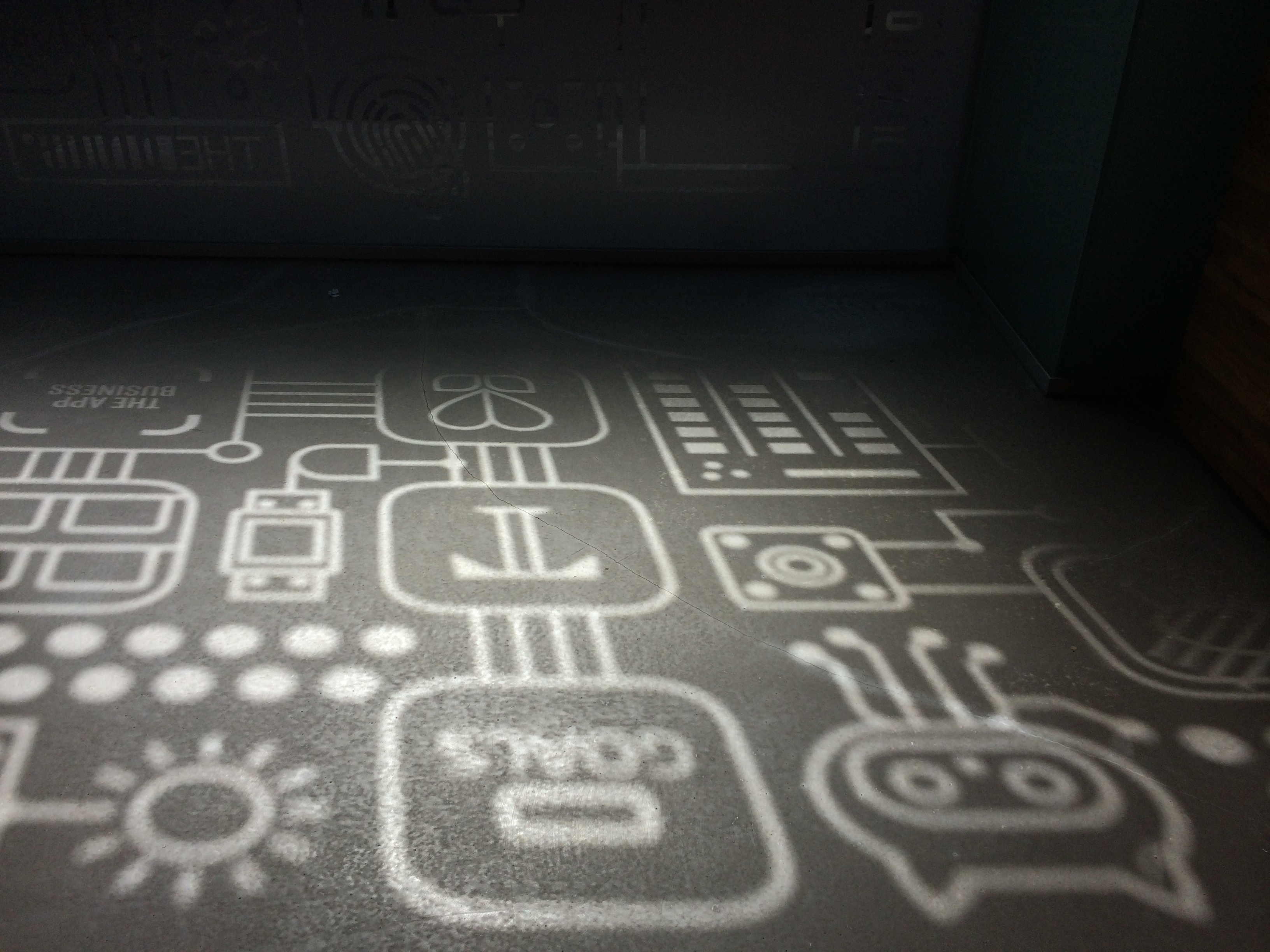
The App Business - Glass Frosting
Moving onto the ground floor of a building right in the middle of Soho London we wanted to make our presence felt. I adapted and expanded on some existing branded materials to give ourselves a "shop front" that kept unwanted eyes out but also spoke to the culture of the company and helped advertised our clients.
- Illustration
- Art working
Concept visuals
Unused but still loved concepts for projects that never saw the light of day.
- Concepting
- Interface Design
- Icon Design
For more information on any of these projects feel free to reach out to me on Twitter @imcconchie